New vehicles sold in 2016 averaged 23.7 miles per gallon, compared with 23.3 miles per gallon in 2015 and 19.9 miles per gallon a decade ago, analysts at Tudor Pickering Holt said in a recent note.
That 1.7% improvement in 2016 is only a squeak more than the 10-year average gains of 1.6%:
Source: MarketWatch
One major headwind to fuel economy is Americans’ “seemingly insatiable appetite for trucks,” the analysts said. Trucks’ fuel economy averaged 21 miles per gallon last year, compared with cars at 29 miles per gallon. Six out of 10 new vehicles sold in 2016 were trucks, the highest share since at least 2000, they said.
Then there’s low penetration for hybrid vehicles, which had a market share of 2.9% last year, down from a peak 3.7% in 2013. Declining gasoline prices in the last couple of years are the most likely cause of falling hybrid share, the Tudor Pickering Holt analysts said.
Correcting misconceptions about markets, economics, asset prices, derivatives, equities, debt and finance
Tuesday, January 24, 2017
New Vehicle Fuel Economy Averaged 1.7% Improvement In 2016 And A 10-year Average Gain Of 1.6%
Posted By Milton Recht
From MarketWatch, "America’s love of gas guzzlers is hampering progress on fuel economy" by Claudia Assis:
US Family Wealth Increased From 1989 To 2013 Due To Population Aging And Increased Education
Posted By Milton Recht
From Congressional Budget Office, "Changes in Family Wealth, 1989 to 2013" January 18, 2017, Presentation by Nadia Karamcheva, an analyst in CBO’s Microeconomic Studies Division, to the Savings and Retirement Foundation in Washington, DC:
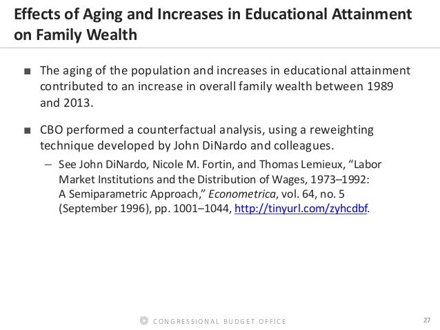
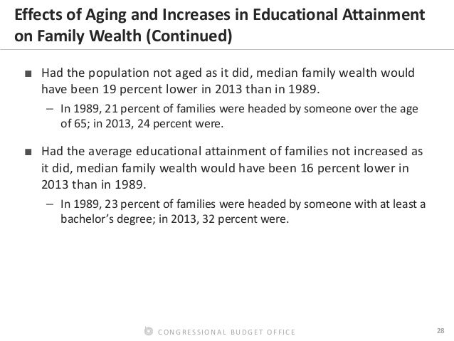
Pages 28 and 29 from CBO presentation, with the full slide presentation following the two page excerpt:
Full CBO slide presentation follows:*** Older people have more work experience and with greater experience comes higher wages with a benefit of increased savings. Older people also have had more time to accumulate wealth from savings and investments, to benefit from the compounding effect of time from the interest and gains on those savings and investments, and to have more time to pay down debt from their earlier years.
As I mentioned in my earlier posts, "US Income Inequality Is Linked To Education Levels," "Unequal Income Comes From Unequal Education," and "US Income Inequality Is Linked To Education Levels," more education leads to higher incomes.
With the known positive effects of age and education on income and wealth, it is not surprising CBO checked to see the effect of the changes in age and education of the US population from 1989 to 2013.
Wealth inequality increases between 1989 and 2013 were due to increased age and increased education. As long as the US population is increasing in average age and in average education levels, wealth inequality will increase. When and if the US population average age and education level stop increasing, then income and wealth inequality will stabilize and stop increasing.
Pages 28 and 29 from CBO presentation, with the full slide presentation following the two page excerpt:
Source: CBO, Page 28
Source: CBO, Page 29
Full CBO slide presentation follows:
As I mentioned in my earlier posts, "US Income Inequality Is Linked To Education Levels," "Unequal Income Comes From Unequal Education," and "US Income Inequality Is Linked To Education Levels," more education leads to higher incomes.
With the known positive effects of age and education on income and wealth, it is not surprising CBO checked to see the effect of the changes in age and education of the US population from 1989 to 2013.
Wealth inequality increases between 1989 and 2013 were due to increased age and increased education. As long as the US population is increasing in average age and in average education levels, wealth inequality will increase. When and if the US population average age and education level stop increasing, then income and wealth inequality will stabilize and stop increasing.
Wednesday, January 18, 2017
Pass-Through Businesses Are A Majority Of US Companies And Employ More Than Half Of US Private Sector Workers
Posted By Milton Recht
From Tax Foundation, "Pass-Through Businesses: Data and Policy" by Scott Greenberg:
Figure 1
Source: Tax Foundation
In addition, pass-through businesses [sole proprietorship, partnership, S corporation] are also responsible for more than half of private-sector jobs in the U.S. (Figure 2). In 2014, 57.3 percent of the U.S. private-sector workforce was employed or self-employed at a pass-through business [does not include unemployed individuals seeking work.] In numerical terms, U.S. pass-through businesses employed 73.0 million people in 2014, compared to 54.3 million employees of C corporations [may double count some individuals who were simultaneously self-employed as a sole proprietorship and employed by a different business as well.]
Within the pass-through sector, in 2014, S corporations had the most employees: 32.5 million people, or 25.5 percent of the private sector workforce. Although sole proprietorships are the most common form of business in the U.S., they accounted for only 19.6 percent of all private-sector jobs. This is because most sole proprietorships consist of one self-employed individual, without any other employees.
Figure 2
Source: Tax Foundation
In 49 out of 50 states, pass-through businesses employ over 50 percent of the private workforce. The one exception is Hawaii, where pass-through businesses account for 49.9 percent of private-sector jobs. In four states, pass-through businesses are responsible for over 65 percent of the private-sector workforce: Montana (68.6 percent), South Dakota (66.3 percent), Idaho (65.4 percent), and Vermont (65.2 percent).
Friday, January 13, 2017
CBO Expects A 30-Year Decline In US Labor Force Participation
Posted By Milton Recht
From Congressional Budget Office, "CBO’s Long-Term Projections of Labor Force Participation" Posted by Joshua Montes, Xiaotong Niu, and Julie Topoleski on January 13, 2017:
What Are CBO’s Current Projections of Labor Force Participation?
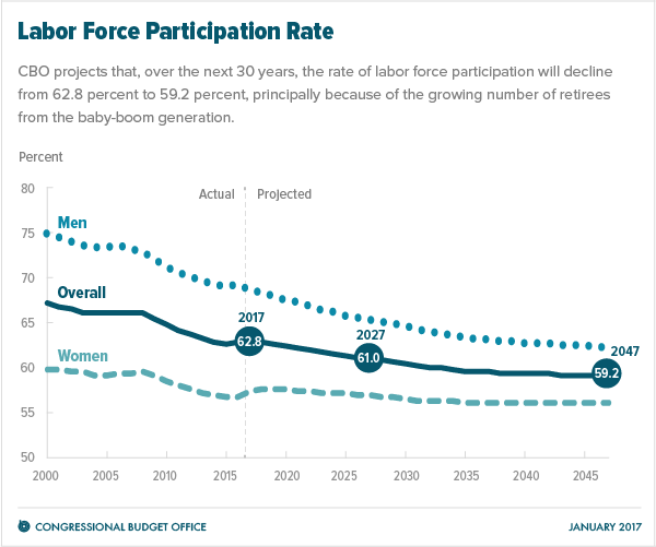
CBO projects that the rate of labor force participation (that is, the number of people who are either working or seeking work as a share of the civilian noninstitutionalized population age 16 or older) will decline from 62.8 percent in 2017 to 61.0 percent in 2027 and to 59.2 percent in 2047—constituting a drop of 3.7 percentage points over 30 years (see the figure below). The projected decline in the participation rate is faster for men than for women.
Source: CBO
The continued retirement of the baby-boom generation is the most important factor driving down the overall participation rate.
Tuesday, January 10, 2017
Mexico's Better Trade Deals, Not Labor Costs, Are A Major Reason For Shifting Auto Production From US
Posted By Milton Recht
From Bloomberg, "Why Trump Tariffs on Mexican Cars Probably Won’t Stop Job Flight" by David Welch and Dave Merrill:
Infrastructure in Mexico lags behind the highway and rail network in the U.S., so it actually costs automakers $300 more per car in additional shipping expenses to produce the vehicle in Mexico and ship it to Europe, and an extra $900 to ship it to the U.S.
That means, even after paying significantly less on labor, a car company is walking away with wage savings of only $300 per car—a fraction of what it costs to build and ship in the U.S. The bulk of the savings are tied to Mexico’s trade agreements and cheaper parts.
Automakers can save $1,500 per car on cheaper Mexican auto parts. Certainly, a lot of those savings are tied to the lower wages workers in Mexico are paid. But some of these parts are imported to Mexico tariff-free from countries in Europe and Asia, particularly for the foreign automakers who are increasingly investing in Mexico instead of the U.S. Since the U.S. doesn’t have as many free trade agreements, some of the automakers would pay extra for some of those parts if they made those models in the U.S., said Bernard Swiecki, senior analyst at CAR.
The same company selling that mid-sized car saves $2,500 per vehicle that it builds in Mexico and ships to Europe because the U.S. doesn't have a trade agreement with the EU. That's more than it saves in parts and wages once shipping costs are figured in.
 |
| Source: Bloomberg |
Friday, January 6, 2017
Top Ten US States For Inbound And Outbound Population Migration In 2016
Posted By Milton Recht
From Tax Foundation, "Where Did Americans Move in 2016?" by Nicole Kaeding:
From the original study, "2016 United Movers Study: South Dakota Overtakes Oregon as the Nation’s 'Top Moving Destination' " by United Van Lines:
The map below shows the top inbound and outbound states for 2016.
Source: Tax Foundation
South Dakota, Vermont, and Oregon were the states with the highest percentage of inbound moves. New Jersey, Illinois, and New York had the highest percentage of outbound moves. South Dakota had a 68 percent inbound rate, while New Jersey had a 63 percent outbound rate.
From the original study, "2016 United Movers Study: South Dakota Overtakes Oregon as the Nation’s 'Top Moving Destination' " by United Van Lines:
United has tracked migration patterns annually on a state-by-state basis since 1977. For 2016, the study is based on household moves handled by United within the 48 contiguous states and Washington, D.C. This study ranks states based off the inbound and outbound percentages of total moves in each state. United classifies states as "high inbound" if 55 percent or more of the moves are going into a state, "high outbound" if 55 percent or more moves were coming out of a state or “balanced” if the difference between inbound and outbound is negligible.
Moving In: The top inbound states of 2016 were:South Dakota is the most popular moving destination of 2016 with nearly 68 percent of moves to and from the state being inbound. The state has continued to climb the ranks, increasing inbound migration by 23 percent over the past five years. New to the 2016 top inbound list are South Dakota at No. 1 and Arizona at No. 10 with 68 and 57 percent inbound moves, respectively. Moving Out: The top outbound states for 2016 were:
- South Dakota
- Vermont
- Oregon
- Idaho
- South Carolina
- Washington
- District of Columbia
- North Carolina
- Nevada
- Arizona
In addition to the Northeast, Illinois (63 percent) moved up one spot on the outbound list, to no. 2, ranking in the top five for the last eight years. New additions to the 2016 top outbound list include Kentucky (58 percent), Utah (56 percent) and Pennsylvania (56 percent).Balanced Several states gained approximately the same number of residents as those that left. This list of “balanced” states includes California, New Mexico and Delaware. Delaware appeared on the balanced list for the second consecutive year.
- New Jersey
- Illinois
- New York
- Connecticut
- Kansas
- Kentucky
- West Virginia
- Ohio
- Utah
- Pennsylvania
Thursday, January 5, 2017
States With Higher Than Federal Minimum Wage Chart
Posted By Milton Recht
From Pew Research Center, "5 facts about the minimum wage" by Drew Desilver:
Source: PewResearchCenter
Sunday, January 1, 2017
Flood Risk Increasing In The Northern Half Of The US And Decreasing In The Southern Half
Posted By Milton Recht
From "Flood threats changing across US" on ScienceBlog:
In a new study, University of Iowa engineers determined that, in general, the threat of flooding is growing in the northern half of the U.S. and declining in the southern half. The American Southwest and West, meanwhile, are experiencing decreasing flood risk.
UI engineers Gabriele Villarini and Louise Slater compiled water-height information between 1985 and 2015 from 2,042 stream gauges operated by the U.S. Geological Survey. They then compared the data to satellite information gathered over more than a dozen years by NASA’s Gravity Recovery and Climate Experiment (GRACE) mission showing “basin wetness,” or the amount of water stored in the ground.
What they found was the northern sections of the country, generally, have an increased amount of water stored in the ground, and thus are at greater risk for minor and moderate flooding, two flood categories used by the National Weather Service. Meanwhile, minor to moderate flood risk was decreasing in the southern portions of the U.S., where stored water has declined. (See the below map.)
Source: ScienceBlog
Subscribe to:
Comments (Atom)


